First, we need to define a few terms in order to be more precise with our analysis of social media: impressions, clicks, and reach. Impressions are the number of times a post appears on your page. If a Facebook user is scrolling through their newsfeed and they see an ad or a post, that equals one impression. If they were to see that same post in their newsfeed and then later sees the same post again, perhaps reshared by a friend, that equals two impressions. The number of clicks that a piece of social media content receives is the number of times that a user clicked on that post or ad. So if a single user visits the same post three times, that counts as three clicks even though it was one person. Finally, reach is the number of people who received impressions of a page’s post. So if a Facebook user encounters in their newsfeed a post that was shared by three different friends and then they click on that post twice, this would register as three impressions (appearances of the post in the user’s newsfeed), two clicks (visits by the user to that post), and one reach (the one user in our example).
The dataset used for this website records the number of clicks and impressions for each ad purchased by the IRA, but it does not record the reach of each ad. The fact that reach is not recorded in this dataset is one of its limitations; without this piece of information, we can only estimate how many individuals these ads actually reached. After all, a post with 100 impressions may have only reached 20 people if those 20 people all had friends who were sharing the same post. So while we may lack that piece of data, it is safe to assume that we can infer the reach based on the impressions and clicks since there is certainly a correlation between these three categories: the more impressions an ad had, the more clicks it probably received, and the more people it probably reached.
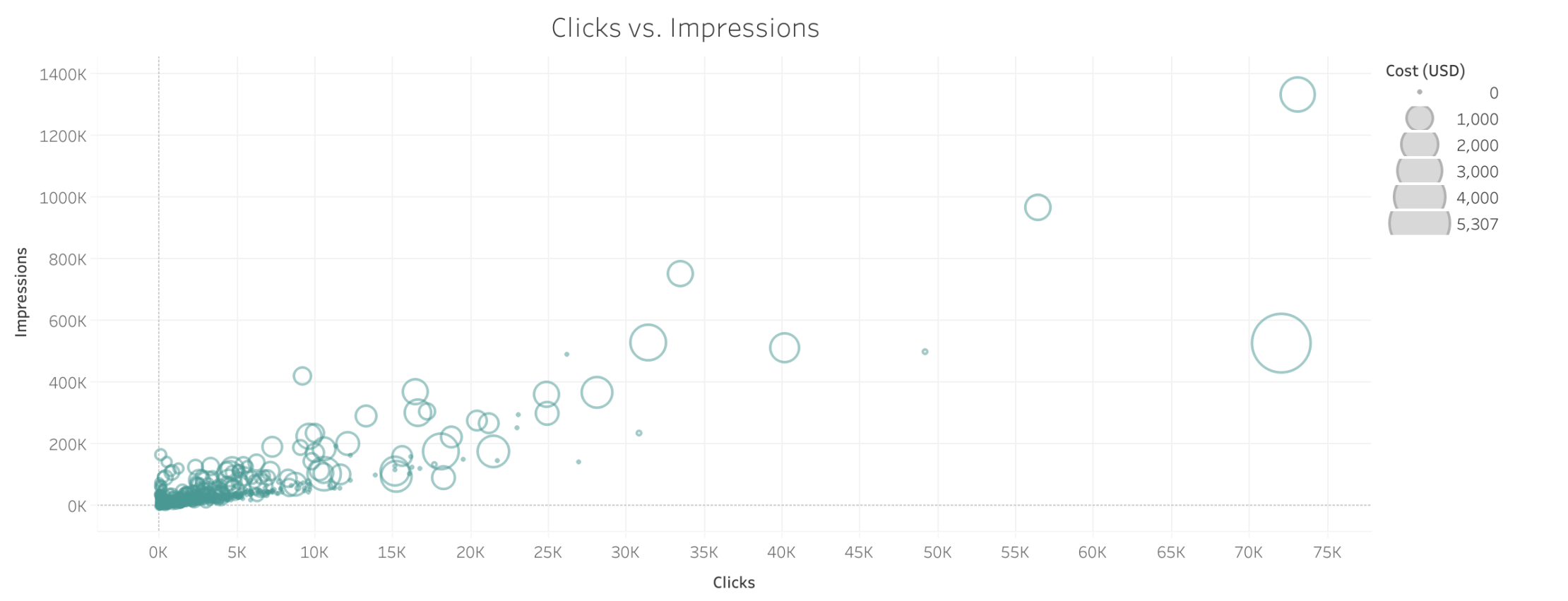
This scatterplot looks at each ad and compares the number of impressions it received versus the number of clicks it received. The correlation between the two categories is apparent from this visualization. The other noteworthy feature about this scatterplot is that the size of each circle corresponds to the cost of each ad. With this in mind, I noticed that among all the ads with 20,000 clicks or more, more than half of them are tiny circles, indicating that a significant portion of the IRA’s most successful ads cost very little. If you hover over the tiny circles in this section of the chart, you’ll notice that all of them were created in February or April 2017. The implication here is that by this point, the IRA pages were well-established with sizable memberships through their work in 2015 and early 2016, so it was easier for them now to generate more clicks and impressions. The last thing I’d like to point out is that if you highlight all the ads that had 20,000 clicks or more, you’ll notice that those ads are overwhelmingly positive in their affect. Of the 19 ads that meet this criteria, 16 either have a tag like “joy” or “love,” or they have no affect tag but based on the text of the ad we can infer that the content was meant to convey positive rather than negative emotion. In a later section, I will return to the topic of affect vis a vis tags used by the IRA ads.
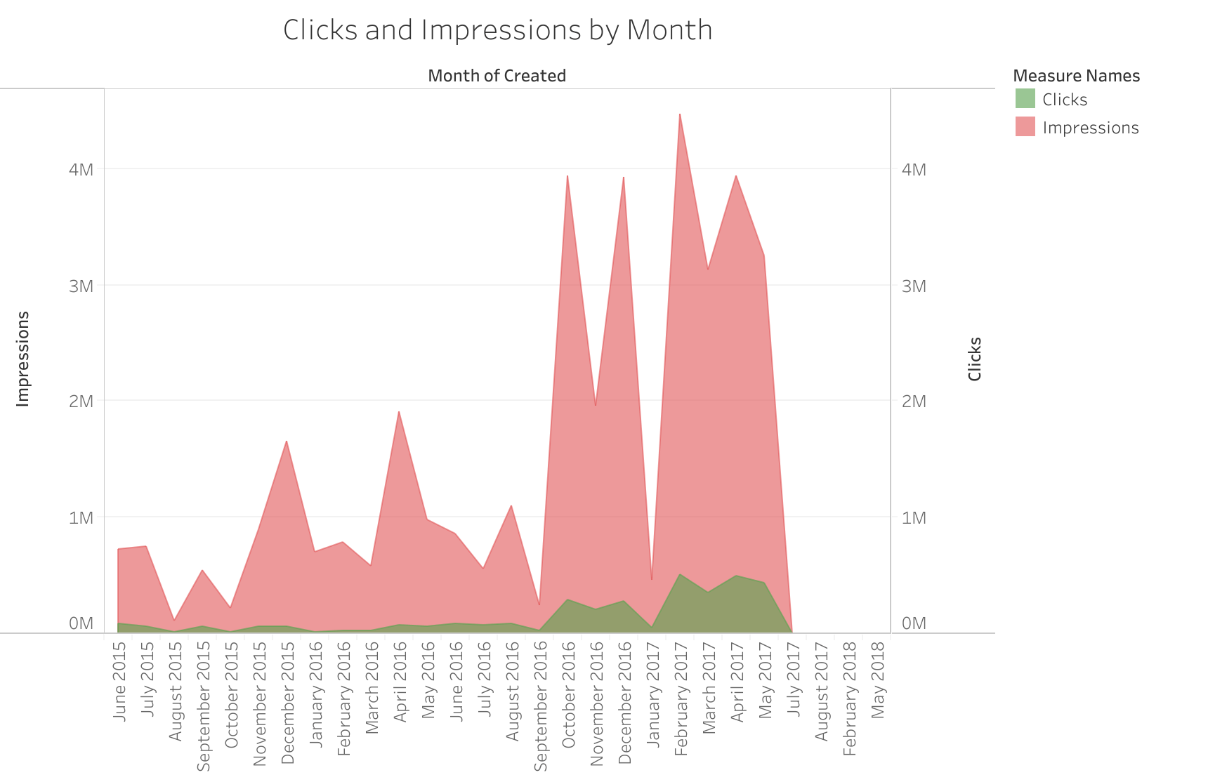
This second visualization is an area graph that illustrates the total number of clicks and impressions for IRA ads in every month of their campaign. What I wanted to illustrate with this visualization is the upward trend in clicks or impressions over time, in contrast to the scatterplot, which doesn’t illustrate time as well as this one does. This gives a good visual illustration of how clicks increased in the second half of the IRA campaign after they had already developed more of a following. This visualization also illustrates the sudden, precipitous drop-off of IRA ads after May 2017, which I will return to in the next section.